Ready to Upgrade Your Website?
Schedule your free Zoom session to discuss how we can design a website that drives results and grows your instructions.


As we move deeper into the mobile-first era, the difference between mobile and desktop website design has become more critical than ever. Businesses, especially estate agents, must go beyond simply having a responsive site. Instead, they need to craft unique experiences tailored specifically to the device being used.
Mobile usage continues to dominate. Today, over 70% of property searches begin on mobile devices, and search engines now factor mobile usability directly into their rankings. But a mobile-friendly website doesn’t just mean your desktop version scales down — it means rethinking how your content, functionality and user experience is delivered based on screen size, intent and behaviour.
The difference between mobile and desktop website experiences stems from more than just the size of the screen. Users interact differently depending on their device. Mobile screens are smaller, often used on-the-go, and operated by touch. Desktop computers offer more screen real estate, a stable browsing environment, and the use of a mouse and keyboard.
This shift in user behaviour affects everything — from how long visitors stay on your site to how they navigate and take action.
For example, estate agency websites report that mobile users spend significantly less time browsing than desktop users. Why? Mobile users often arrive with a specific goal in mind: to search for properties, book a valuation, or arrange a viewing — and they want to do it fast.
To create successful mobile sites that convert, you must go beyond shrinking your web pages to fit smaller screens. Let’s break down the most important elements to tailor.
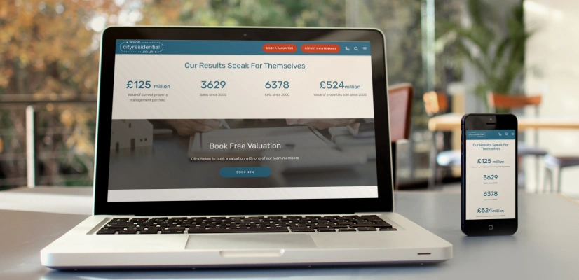
Mobile users have limited patience and expect immediate access to what they’re looking for. Essential actions like “Book a Valuation,” “Arrange a Viewing,” or “Register Your Interest” should always be visible.
Sticky footers or headers are ideal for mobile-friendly websites. They ensure your primary call to action stays in view, no matter where users scroll.
Unlike desktop versions, where you can use multiple columns to structure content, mobile web design restricts you to a single column format. Users scroll vertically, which means the most important content must appear at the top.
Don’t simply mirror your desktop content. Focus on what’s most useful to mobile users and arrange information in a logical, priority-driven flow.
User interaction on a desktop involves a mouse; on mobile devices, it’s all about the finger. This seemingly small difference has major implications for usability.
Clickable elements — such as links, buttons and menus — should be large enough and spaced properly to avoid frustration. A good rule of thumb: make it easy for users to navigate with one hand.
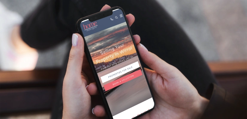
While large, high-resolution images may look stunning on a desktop screen, they often slow down load times on mobile. Speed is everything — especially when it comes to search results. Google and other search engines favour websites that load quickly, especially on mobile.
Only include images that add value, and compress or scale them appropriately. Mobile users are typically action-oriented, so avoid cluttering pages with unnecessary visuals.
Reading long chunks of text on smaller screen devices can be exhausting. Consider breaking up text with headings, icons, or collapsible sections to improve scannability.
If your mobile visitors don’t need detailed background to take action, reduce the word count. Less is often more when it comes to user experience on mobile.
Forms and navigation are two areas where the difference between mobile and desktop website performance is most noticeable.
On desktop computers, forms are often placed in sidebars. But on mobile, this real estate disappears. If your form ends up buried under other content, your conversion rates will suffer.
Instead, consider replacing inline forms with buttons that trigger pop-up forms. These buttons can be fixed in the menu or repeated throughout the page, saving space while keeping the form easily accessible.
Mobile sites typically use “hamburger” menus to save space. But they can become cumbersome if your navigation is too deep. While desktop versions can handle three or more levels, mobile-friendly websites should be limited to one or two levels max.
If deeper navigation is required, use alternative pathways — like in-page links or content blocks — to guide users without overcomplicating the menu.

While PDFs may serve desktop users well, they are rarely suitable for mobile screens. PDF files often don’t scale well, require additional time to load, and aren’t designed with smaller screens in mind. Most mobile users prefer content to be displayed directly on the web page.
If you rely on PDF brochures or property particulars, make sure the same information is available in HTML format. This not only improves usability but also enhances SEO.
Responsive web design is still the foundation for building sites that work across devices. But responsive doesn’t mean identical. The real goal is delivering a tailored experience based on device-specific behaviours and constraints.
A well-designed responsive site will adapt content, layout, and navigation to suit the platform — ensuring that mobile users aren’t left squinting or clicking the wrong buttons, while desktop users still enjoy a rich, detailed interface.
The difference between mobile and desktop website design isn’t just technical — it’s strategic. It’s about recognising how different audiences engage with your brand on different devices, and building experiences that reflect those differences.
Estate agents — and indeed any business — can no longer afford to treat mobile as an afterthought. By rethinking layout, content structure, and functionality for mobile users, you can drive better engagement, higher conversion rates, and stronger performance in search results.
Whether you’re starting from scratch or updating your existing site, we can help you design a website that looks great and functions smoothly on both mobile and desktop.
Contact us today to create a site that works for every user—on any device.
Schedule your free Zoom session to discuss how we can design a website that drives results and grows your instructions.
Contact us using this form and we will come back to you within the next 2 working days.
"*" indicates required fields

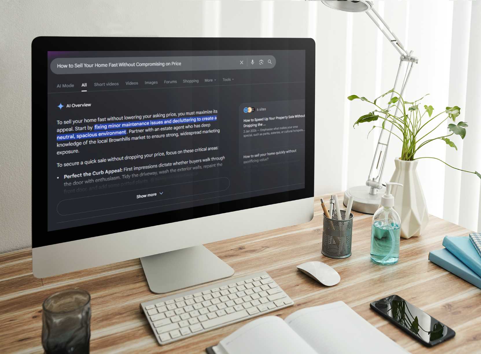
Estate agents can appear in Google AI Overviews by ensuring their website pages are indexed, eligible for snippets, and built on helpful,

Discover 11 principles of estate agency web design to create a property website that attracts clients and improves user experience.

Discover Amplify — Art Division’s new AI-powered marketing solution for estate agents. Instantly create SEO blogs, social posts, and bran...